请注意,本文编写于 185 天前,最后修改于 185 天前,其中某些信息可能已经过时。
目录
WinForms中使用OxyPlot创建面积图的详细指南。面积图是一种非常有用的图表类型,可以直观地展示数据随时间的变化趋势,并且能够很好地表现数据的累积效果。
准备工作
首先,我们需要在项目中添加OxyPlot的引用。您可以通过NuGet包管理器来安装OxyPlot。在Visual Studio中,右击您的项目,选择"管理NuGet包",然后搜索并安装以下包:
- OxyPlot.Core
- OxyPlot.WindowsForms
安装完成后,在您的代码文件顶部添加以下using语句:
C#using OxyPlot;
using OxyPlot.Series;
using OxyPlot.WindowsForms;
创建基本面积图
让我们从一个简单的面积图开始。假设我们要展示某产品五年的销售数据。
C#public partial class Form1 : Form
{
    public Form1()
    {
        InitializeComponent();
        CreateBasicAreaChart();
    }

    private void CreateBasicAreaChart()
    {
        var plotView = new PlotView();
        plotView.Dock = DockStyle.Fill;

        var model = new PlotModel { Title = "产品销售趋势" };

        var areaSeries = new AreaSeries
        {
            Color = OxyColors.LightBlue,
            StrokeThickness = 2
        };

        // 添加数据点
        areaSeries.Points.Add(new DataPoint(2018, 100));
        areaSeries.Points.Add(new DataPoint(2019, 150));
        areaSeries.Points.Add(new DataPoint(2020, 200));
        areaSeries.Points.Add(new DataPoint(2021, 180));
        areaSeries.Points.Add(new DataPoint(2022, 250));

        model.Series.Add(areaSeries);
        plotView.Model = model;

        this.Controls.Add(plotView);
    }
}
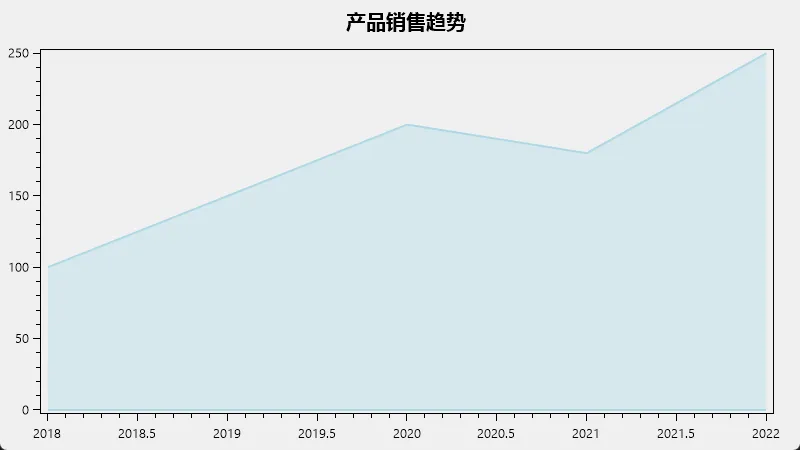
这段代码创建了一个基本的面积图,展示了从2018年到2022年的销售数据。
自定义面积图
现在,让我们对面积图进行一些自定义,使其更加美观和信息丰富。
C#using OxyPlot.Series;
using OxyPlot.WindowsForms;
using OxyPlot;
using OxyPlot.Legends;
using OxyPlot.Axes;
using OxyPlot.Annotations;

namespace OxyApp
{
    public partial class Form1 : Form
    {
         public Form1()
        {
            InitializeComponent();
            CreateCustomAreaChart();
        }
        private void CreateCustomAreaChart()
        {
            var plotView = new PlotView();
            plotView.Dock = DockStyle.Fill;

            var model = new PlotModel
            {
                Title = "产品销售趋势",

            };

            model.Legends.Add(new Legend()
            {
                LegendPosition = LegendPosition.RightTop,
                LegendPlacement = LegendPlacement.Outside
            });

            // 自定义X轴
            model.Axes.Add(new LinearAxis
            {
                Position = AxisPosition.Bottom,
                Title = "年份",
                MajorStep = 1,
                MinorStep = 1,
                Minimum = 2018,
                Maximum = 2022
            });

            // 自定义Y轴
            model.Axes.Add(new LinearAxis
            {
                Position = AxisPosition.Left,
                Title = "销售量 (百万)",
                MajorStep = 50,
                MinorStep = 10,
                Minimum = 0,
                Maximum = 300
            });

            var areaSeries = new AreaSeries
            {
                Title = "产品A",
                Color = OxyColor.FromAColor(120, OxyColors.LightBlue),
                StrokeThickness = 2,
                MarkerType = MarkerType.Circle,
                MarkerSize = 4,
                MarkerStroke = OxyColors.Blue,
                MarkerFill = OxyColors.White
            };

            // 添加数据点
            areaSeries.Points.Add(new DataPoint(2018, 100));
            areaSeries.Points.Add(new DataPoint(2019, 150));
            areaSeries.Points.Add(new DataPoint(2020, 200));
            areaSeries.Points.Add(new DataPoint(2021, 180));
            areaSeries.Points.Add(new DataPoint(2022, 250));

            model.Series.Add(areaSeries);
            plotView.Model = model;

            this.Controls.Add(plotView);
        }
    }
}
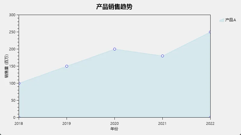
这个例子添加了以下自定义:
- 设置了图例位置
- 自定义了X轴和Y轴的标题、刻度和范围
- 为数据点添加了标记
- 调整了面积的透明度
多系列面积图
接下来,让我们创建一个包含多个系列的面积图,比较多个产品的销售趋势。
C#using OxyPlot.Series;
using OxyPlot.WindowsForms;
using OxyPlot;
using OxyPlot.Legends;
using OxyPlot.Axes;
using OxyPlot.Annotations;

namespace OxyApp
{
    public partial class Form1 : Form
    {
        public Form1()
        {
            InitializeComponent();
            CreateMultiSeriesAreaChart();
        }
        private void CreateMultiSeriesAreaChart()
        {
            var plotView = new PlotView();
            plotView.Dock = DockStyle.Fill;

            var model = new PlotModel
            {
                Title = "多产品销售趋势对比"
            };

            model.Legends.Add(new Legend()
            {
                LegendPosition = LegendPosition.RightTop,
                LegendPlacement = LegendPlacement.Outside
            });

            // 设置坐标轴(与上一个例子相同)

            var productA = new AreaSeries
            {
                Title = "产品A",
                Color = OxyColor.FromAColor(120, OxyColors.LightBlue),
                BrokenLineColor = OxyColors.Blue,
                StrokeThickness = 2
            };

            var productB = new AreaSeries
            {
                Title = "产品B",
                Color = OxyColor.FromAColor(120, OxyColors.LightGreen),
                BrokenLineColor = OxyColors.Green,
                StrokeThickness = 2
            };

            // 添加数据点
            productA.Points.AddRange(new[]
            {
        new DataPoint(2018, 100),
        new DataPoint(2019, 150),
        new DataPoint(2020, 200),
        new DataPoint(2021, 180),
        new DataPoint(2022, 250)
    });

            productB.Points.AddRange(new[]
            {
        new DataPoint(2018, 80),
        new DataPoint(2019, 120),
        new DataPoint(2020, 180),
        new DataPoint(2021, 220),
        new DataPoint(2022, 200)
    });

            model.Series.Add(productA);
            model.Series.Add(productB);
            plotView.Model = model;

            this.Controls.Add(plotView);
        }
    }
}

这个例子展示了如何在同一个图表中比较两个产品的销售趋势。
结论
通过这些例子,您应该已经掌握了如何在WinForms应用中使用OxyPlot创建各种类型的面积图。从基本的单系列面积图到复杂的多系列堆叠面积图,OxyPlot都能轻松实现。记住,图表的关键在于清晰地传达信息,所以在设计图表时要考虑数据的特性和您想要传达的信息。
希望这个指南对您有所帮助!如果您有任何问题或需要进一步的解释,请随时询问。
本文作者:rick
本文链接:
版权声明:本博客所有文章除特别声明外,均采用 BY-NC-SA 许可协议。转载请注明出处!
目录