目录
简介
ColorListView 是一个继承自 ListView 的自定义控件,它提供了更丰富的单元格样式设置功能。这个控件允许用户为每个单元格设置自定义的背景颜色、填充百分比和图标。通过重写绘制方法,ColorListView 实现了这些自定义功能,同时保留了原有 ListView 的基本特性。
主要特性
- 自定义单元格背景颜色
- 可调节的背景填充百分比
- 支持为单元格添加自定义图标
- 保留原有的选中和焦点状态显示
实现细节
CellInfo 类
CellInfo 是一个私有内部类,用于存储每个单元格的自定义信息:
C#private class CellInfo
{
    public Color BackColor { get; set; }
    public float FillPercentage { get; set; }
    public Image Icon { get; set; }

    public CellInfo(Color backColor, float fillPercentage, Image icon = null)
    {
        BackColor = backColor;
        FillPercentage = Math.Max(0, Math.Min(100, fillPercentage)) / 100f;
        Icon = icon;
    }
}
这个类封装了单元格的背景颜色、填充百分比和图标信息。
自定义信息存储
控件使用一个字典来存储每个单元格的自定义信息:
C#private Dictionary<Point, CellInfo> customCellInfo;
字典的键是一个 Point 对象,表示单元格的列索引和行索引。
初始化
在构造函数中,控件进行了必要的初始化:
C#public ColorListView()
{
    customCellInfo = new Dictionary<Point, CellInfo>();
    this.OwnerDraw = true;
    SetStyle(ControlStyles.DoubleBuffer | ControlStyles.OptimizedDoubleBuffer | ControlStyles.AllPaintingInWmPaint, true);
    UpdateStyles();
}
这里启用了自定义绘制和双缓冲,以提高绘制性能和减少闪烁。
设置单元格样式
控件提供了两个公共方法来设置单元格样式:
C#public void SetCellBackColor(int rowIndex, int columnIndex, Color color, float fillPercentage = 100)
{
    // 实现代码...
}

public void SetCellIcon(int rowIndex, int columnIndex, Image icon)
{
    // 实现代码...
}
这些方法允许用户为指定的单元格设置背景颜色、填充百分比和图标。
自定义绘制
控件重写了 OnDrawItem 和 OnDrawColumnHeader 方法来实现自定义绘制:
C#protected override void OnDrawColumnHeader(DrawListViewColumnHeaderEventArgs e)
{
    e.DrawDefault = true;
}

protected override void OnDrawItem(DrawListViewItemEventArgs e)
{
    // 实现代码...
}
OnDrawItem 方法负责绘制每一行,而具体的单元格绘制则由 DrawSubItem 私有方法完成。
单元格绘制
DrawSubItem 方法是实现自定义绘制的核心:
C#private void DrawSubItem(Graphics g, ListViewItem item, int columnIndex, bool isSelected)
{
    // 实现代码...
}
这个方法处理了以下几个方面:
- 绘制自定义背景色和填充
- 绘制图标(如果有)
- 绘制文本
- 处理选中状态
辅助方法
GetSubItemBounds 方法用于计算每个子项的边界矩形,这对于正确定位绘制内容非常重要:
C#private Rectangle GetSubItemBounds(ListViewItem item, int subItemIndex)
{
    // 实现代码...
}
完整代码
C#using System;
using System.Collections.Generic;
using System.Drawing;
using System.Windows.Forms;

public class ColorListView : ListView
{
    private class CellInfo
    {
        public Color BackColor { get; set; }
        public float FillPercentage { get; set; }
        public Image Icon { get; set; }

        public CellInfo(Color backColor, float fillPercentage, Image icon = null)
        {
            BackColor = backColor;
            FillPercentage = Math.Max(0, Math.Min(100, fillPercentage)) / 100f;
            Icon = icon;
        }
    }

    private Dictionary<Point, CellInfo> customCellInfo;

    public ColorListView()
    {
        customCellInfo = new Dictionary<Point, CellInfo>();

        this.OwnerDraw = true;
        SetStyle(ControlStyles.DoubleBuffer | ControlStyles.OptimizedDoubleBuffer | ControlStyles.AllPaintingInWmPaint, true);
        UpdateStyles();
    }

    public void SetCellBackColor(int rowIndex, int columnIndex, Color color, float fillPercentage = 100)
    {
        Point key = new Point(columnIndex, rowIndex);
        if (customCellInfo.TryGetValue(key, out CellInfo info))
        {
            info.BackColor = color;
            info.FillPercentage = fillPercentage / 100f;
        }
        else
        {
            customCellInfo[key] = new CellInfo(color, fillPercentage);
        }
        Invalidate();
    }

    public void SetCellIcon(int rowIndex, int columnIndex, Image icon)
    {
        Point key = new Point(columnIndex, rowIndex);
        if (customCellInfo.TryGetValue(key, out CellInfo info))
        {
            info.Icon = icon;
        }
        else
        {
            customCellInfo[key] = new CellInfo(Color.Transparent, 0, icon);
        }
        Invalidate();
    }

    protected override void OnDrawColumnHeader(DrawListViewColumnHeaderEventArgs e)
    {
        e.DrawDefault = true;
    }

    protected override void OnDrawItem(DrawListViewItemEventArgs e)
    {
        e.DrawDefault = false;

        if (e.Item.Selected)
        {
            using (SolidBrush brush = new SolidBrush(SystemColors.Highlight))
            {
                e.Graphics.FillRectangle(brush, e.Bounds);
            }
        }
        else
        {
            e.DrawBackground();
        }

        for (int i = 0; i < this.Columns.Count; i++)
        {
            DrawSubItem(e.Graphics, e.Item, i, e.Item.Selected);
        }

        if ((e.State & ListViewItemStates.Focused) != 0)
        {
            e.DrawFocusRectangle();
        }
    }

    private void DrawSubItem(Graphics g, ListViewItem item, int columnIndex, bool isSelected)
    {
        Rectangle bounds = GetSubItemBounds(item, columnIndex);

        Point cellKey = new Point(columnIndex, item.Index);
        if (customCellInfo.TryGetValue(cellKey, out CellInfo customInfo) && !isSelected)
        {
            int fillWidth = (int)(bounds.Width * customInfo.FillPercentage);
            Rectangle fillRect = new Rectangle(bounds.X, bounds.Y, fillWidth, bounds.Height);

            using (SolidBrush brush = new SolidBrush(customInfo.BackColor))
            {
                g.FillRectangle(brush, fillRect);
            }
        }

        string text = columnIndex == 0 ? item.Text : item.SubItems[columnIndex].Text;
        Color textColor = isSelected ? SystemColors.HighlightText : item.ForeColor;

        // Draw icon if exists
        if (customInfo != null && customInfo.Icon != null)
        {
            int iconSize = bounds.Height - 4; // Leave some padding
            Rectangle iconRect = new Rectangle(bounds.X + 2, bounds.Y + 2, iconSize, iconSize);
            g.DrawImage(customInfo.Icon, iconRect);
            bounds.X += iconSize + 4; // Move text to the right of the icon
            bounds.Width -= iconSize + 4;
        }

        TextRenderer.DrawText(g, text, this.Font, bounds, textColor, TextFormatFlags.Left | TextFormatFlags.VerticalCenter);
    }

    private Rectangle GetSubItemBounds(ListViewItem item, int subItemIndex)
    {
        if (item == null)
            throw new ArgumentNullException("item");

        Rectangle subItemRect = Rectangle.Empty;

        if (subItemIndex >= 0 && subItemIndex < this.Columns.Count)
        {
            Rectangle lviBounds = item.GetBounds(ItemBoundsPortion.Entire);
            int subItemX = lviBounds.Left;

            for (int i = 0; i < subItemIndex; i++)
                subItemX += this.Columns[i].Width;

            subItemRect = new Rectangle(subItemX, lviBounds.Top, this.Columns[subItemIndex].Width, lviBounds.Height);
        }

        return subItemRect;
    }
}
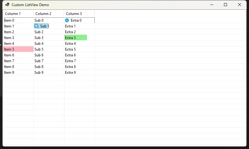
使用示例
以下是如何使用 ColorListView 的简单示例:
C#public partial class Form1 : Form
{
    private ColorListView customListView;

    public Form1()
    {
        InitializeComponent();

        customListView = new ColorListView();
        // 设置 CustomListView 属性
        this.customListView.Dock = DockStyle.Fill;
        this.customListView.View = View.Details;
        this.customListView.FullRowSelect = true;
        this.customListView.GridLines = true;

        // 添加列
        this.customListView.Columns.Add("Column 1", 100);
        this.customListView.Columns.Add("Column 2", 100);
        this.customListView.Columns.Add("Column 3", 100);

        // 添加一些测试数据
        for (int i = 0; i < 10; i++)
        {
            ListViewItem item = new ListViewItem(new string[] { $"Item {i}", $"Sub {i}", $"Extra {i}" });
            this.customListView.Items.Add(item);
        }

        // 设置一些单元格的自定义背景色
        this.customListView.SetCellBackColor(1, 1, Color.LightBlue, 50);  // 50% 填充
        this.customListView.SetCellBackColor(3, 2, Color.LightGreen, 75);  // 75% 填充
        this.customListView.SetCellBackColor(5, 0, Color.LightPink, 100);  // 100% 填充(默认)


        Image icon1 = Image.FromFile("add.png");
        customListView.SetCellIcon(0, 2, icon1);

        Image icon2 = Image.FromFile("search.png");
        customListView.SetCellIcon(1, 1, icon2);

        this.Controls.Add(this.customListView);
        this.Name = "MainForm";
        this.Text = "Custom ListView Demo";

    }


}
结论
ColorListView 通过继承和自定义绘制,扩展了标准 ListView 控件的功能。它提供了更灵活的单元格样式设置选项,同时保持了良好的性能和原有的基本功能。这个控件特别适用于需要在列表中展示更丰富视觉信息的应用场景。
本文作者:rick
本文链接:
版权声明:本博客所有文章除特别声明外,均采用 BY-NC-SA 许可协议。转载请注明出处!