目录
OxyPlot是一个强大的跨平台绘图库,非常适合在WinForms应用程序中创建各种类型的图表。本指南将重点介绍如何使用OxyPlot创建各种线图,并提供多个完整的示例。
环境设置
首先,确保您已经安装了OxyPlot。在Visual Studio中,通过NuGet包管理器安装以下包:
- OxyPlot.Core
- OxyPlot.WindowsForms
或者在包管理器控制台中运行:
C#Install-Package OxyPlot.Core
Install-Package OxyPlot.WindowsForms
在您的Form类中,添加以下using语句:
C#using OxyPlot;
using OxyPlot.Series;
using OxyPlot.WindowsForms;
基本线图
让我们从一个基本的线图开始。这个例子展示了如何创建一个简单的正弦波线图。
C#public partial class Form1 : Form
{
    public Form1()
    {
        InitializeComponent();
        CreateBasicLineChart();
    }

    private void CreateBasicLineChart()
    {
        var plotView = new PlotView();
        plotView.Dock = DockStyle.Fill;
        this.Controls.Add(plotView);

        var plotModel = new PlotModel { Title = "Basic Line Chart" };
        var series = new LineSeries { Title = "sin(x)" };

        for (double x = 0; x < 10; x += 0.1)
        {
            series.Points.Add(new DataPoint(x, Math.Sin(x)));
        }

        plotModel.Series.Add(series);
        plotView.Model = plotModel;
    }
}
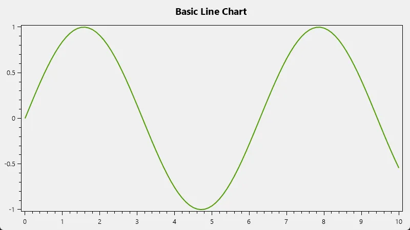
这个例子创建了一个基本的正弦波线图,展示了如何设置PlotView,创建PlotModel和LineSeries,以及如何添加数据点。
多系列线图
下面的例子展示了如何在一个图表中创建多个线系列。
C#private void CreateMultiSeriesLineChart()
{
    var plotView = new PlotView();
    plotView.Dock = DockStyle.Fill;
    this.Controls.Add(plotView);

    var plotModel = new PlotModel { Title = "Multi-Series Line Chart" };

    var series1 = new LineSeries { Title = "sin(x)", Color = OxyColors.Blue };
    var series2 = new LineSeries { Title = "cos(x)", Color = OxyColors.Red };

    for (double x = 0; x < 10; x += 0.1)
    {
        series1.Points.Add(new DataPoint(x, Math.Sin(x)));
        series2.Points.Add(new DataPoint(x, Math.Cos(x)));
    }

    plotModel.Series.Add(series1);
    plotModel.Series.Add(series2);

    plotModel.Legends.Add(new Legend
    {
        LegendPosition = LegendPosition.TopRight,
        LegendPlacement = LegendPlacement.Inside
    });

    plotView.Model = plotModel;
}
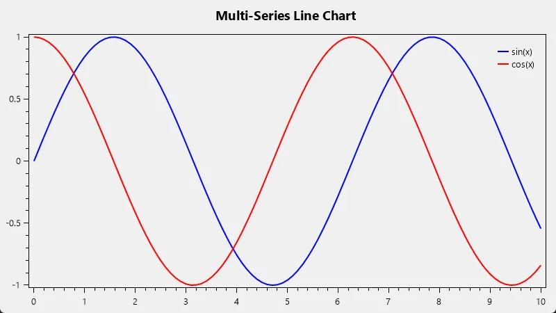
这个例子创建了两个线系列,一个是正弦函数,另一个是余弦函数,并添加了一个图例。
自定义线图样式
OxyPlot提供了丰富的自定义选项。以下是一个自定义样式的示例:
C#private void CreateCustomStyledLineChart()
{
    var plotView = new PlotView();
    plotView.Dock = DockStyle.Fill;
    this.Controls.Add(plotView);

    var plotModel = new PlotModel
    {
        Title = "Custom Styled Line Chart",
        TitleColor = OxyColors.DarkBlue,
        PlotAreaBorderColor = OxyColors.LightGray,
        PlotAreaBorderThickness = new OxyThickness(1)
    };

    var series = new LineSeries
    {
        Title = "Custom Series",
        Color = OxyColors.Red,
        StrokeThickness = 3,
        MarkerType = MarkerType.Circle,
        MarkerSize = 4,
        MarkerStroke = OxyColors.Black,
        MarkerFill = OxyColors.Yellow
    };

    for (int i = 0; i < 10; i++)
    {
        series.Points.Add(new DataPoint(i, Math.Pow(i, 2)));
    }

    plotModel.Series.Add(series);

    var xAxis = new LinearAxis
    {
        Position = AxisPosition.Bottom,
        Title = "X Axis",
        TitleColor = OxyColors.DarkGreen,
        AxislineColor = OxyColors.DarkGray,
        MajorGridlineStyle = LineStyle.Dash,
        MinorGridlineStyle = LineStyle.Dot
    };

    var yAxis = new LinearAxis
    {
        Position = AxisPosition.Left,
        Title = "Y Axis",
        TitleColor = OxyColors.DarkGreen,
        AxislineColor = OxyColors.DarkGray,
        MajorGridlineStyle = LineStyle.Dash,
        MinorGridlineStyle = LineStyle.Dot
    };

    plotModel.Axes.Add(xAxis);
    plotModel.Axes.Add(yAxis);

    plotView.Model = plotModel;
}
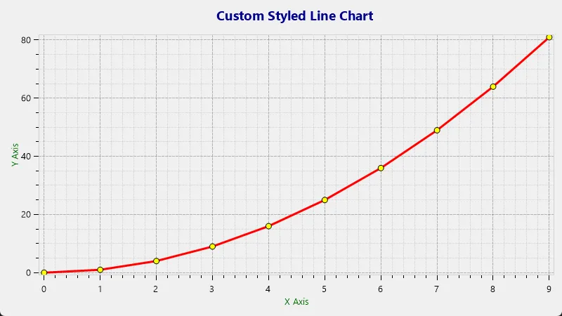
这个例子展示了如何自定义图表的各个方面,包括颜色、线条样式、标记类型等。
对数轴线图
对数轴在显示跨越多个数量级的数据时非常有用。以下是一个使用对数轴的示例:
C#private void CreateLogAxisLineChart()
{
    var plotView = new PlotView();
    plotView.Dock = DockStyle.Fill;
    this.Controls.Add(plotView);

    var plotModel = new PlotModel { Title = "Logarithmic Axis Line Chart" };

    var series = new LineSeries { Title = "Log Series" };

    for (double x = 0.1; x < 1000; x *= 1.1)
    {
        series.Points.Add(new DataPoint(x, Math.Log10(x)));
    }

    plotModel.Series.Add(series);

    plotModel.Axes.Add(new LogarithmicAxis { Position = AxisPosition.Bottom, Title = "Log X" });
    plotModel.Axes.Add(new LinearAxis { Position = AxisPosition.Left, Title = "Y" });

    plotView.Model = plotModel;
}
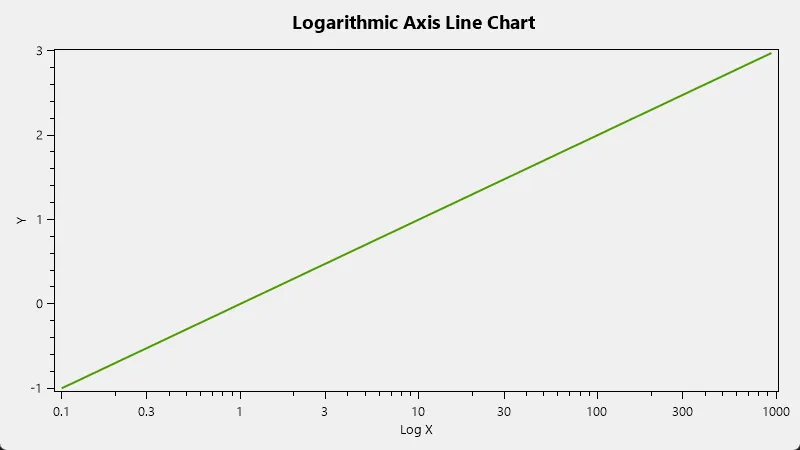
这个例子创建了一个x轴为对数刻度的线图。
日期时间轴线图
对于时间序列数据,使用日期时间轴非常有用。以下是一个示例:
C#private void CreateDateTimeAxisLineChart()
{
    var plotView = new PlotView();
    plotView.Dock = DockStyle.Fill;
    this.Controls.Add(plotView);

    var plotModel = new PlotModel { Title = "Date Time Axis Line Chart" };

    var series = new LineSeries { Title = "Time Series" };

    var startDate = new DateTime(2023, 1, 1);
    for (int i = 0; i < 365; i++)
    {
        var x = DateTimeAxis.ToDouble(startDate.AddDays(i));
        var y = Math.Sin(i * 0.1) * 10 + 20;  // 模拟温度数据
        series.Points.Add(new DataPoint(x, y));
    }

    plotModel.Series.Add(series);

    plotModel.Axes.Add(new DateTimeAxis { Position = AxisPosition.Bottom, Title = "Date", StringFormat = "yyyy-MM-dd" });
    plotModel.Axes.Add(new LinearAxis { Position = AxisPosition.Left, Title = "Temperature (°C)" });

    plotView.Model = plotModel;
}
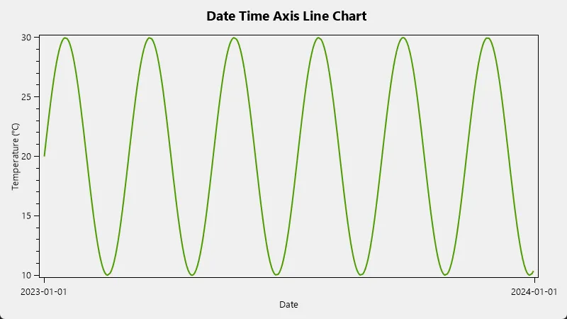
这个例子创建了一个带有日期时间x轴的线图,模拟了一年的温度变化。
带标记的线图
添加数据点标记可以使线图更易读。以下是一个带标记的线图示例:
C#private void CreateLineChartWithMarkers()
{
    var plotView = new PlotView();
    plotView.Dock = DockStyle.Fill;
    this.Controls.Add(plotView);

    var plotModel = new PlotModel { Title = "Line Chart with Markers" };

    var series = new LineSeries
    {
        Title = "Data Series",
        MarkerType = MarkerType.Circle,
        MarkerSize = 4,
        MarkerStroke = OxyColors.White,
        MarkerFill = OxyColors.SkyBlue,
        MarkerStrokeThickness = 1.5
    };

    for (int i = 0; i < 10; i++)
    {
        series.Points.Add(new DataPoint(i, Math.Pow(i, 2)));
    }

    plotModel.Series.Add(series);

    plotView.Model = plotModel;
}
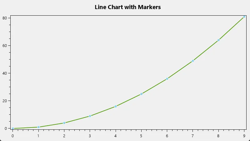
这个例子创建了一个带有圆形标记的线图。
阶梯线图
阶梯线图在显示离散变化的数据时很有用。以下是一个阶梯线图的示例:
C#private void CreateStepLineChart()
{
    var plotView = new PlotView();
    plotView.Dock = DockStyle.Fill;
    this.Controls.Add(plotView);

    var plotModel = new PlotModel { Title = "Step Line Chart" };

    var series = new StairStepSeries
    {
        Title = "Step Series",
        Color = OxyColors.Green,
        StrokeThickness = 2,
        MarkerType = MarkerType.Circle,
        MarkerSize = 4,
        MarkerStroke = OxyColors.Black,
        MarkerFill = OxyColors.Green
    };

    for (int i = 0; i < 10; i++)
    {
        series.Points.Add(new DataPoint(i, Math.Pow(i, 2)));
    }

    plotModel.Series.Add(series);

    plotView.Model = plotModel;
}
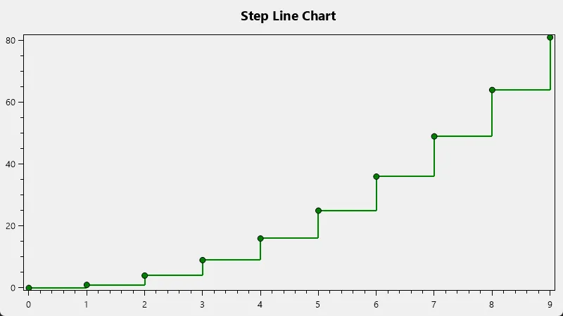
这个例子创建了一个阶梯线图,每个数据点之间用水平和垂直线段连接。
面积图
面积图可以用来显示累积数据或比较多个数据系列。以下是一个面积图的示例:
C#private void CreateAreaChart()
{
    var plotView = new PlotView();
    plotView.Dock = DockStyle.Fill;
    this.Controls.Add(plotView);

    var plotModel = new PlotModel { Title = "Area Chart" };

    var series1 = new AreaSeries
    {
        Title = "Series 1",
        Color = OxyColor.FromArgb(200, 255, 100, 100),
        Fill = OxyColor.FromArgb(100, 255, 100, 100)
    };

    var series2 = new AreaSeries
    {
        Title = "Series 2",
        Color = OxyColor.FromArgb(200, 100, 100, 255),
        Fill = OxyColor.FromArgb(100, 100, 100, 255)
    };

    for (int i = 0; i < 10; i++)
    {
        series1.Points.Add(new DataPoint(i, Math.Sin(i * 0.5) * 10 + 20));
        series2.Points.Add(new DataPoint(i, Math.Cos(i * 0.5) * 10 + 10));
    }

    plotModel.Series.Add(series1);
    plotModel.Series.Add(series2);

    plotModel.Legends.Add(new Legend
    {
        LegendPosition = LegendPosition.TopLeft,
        LegendPlacement = LegendPlacement.Inside
    });

    plotView.Model = plotModel;
}
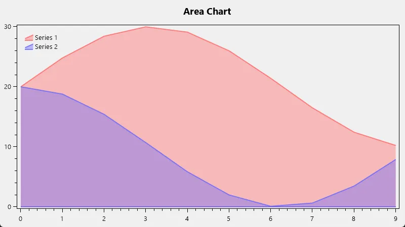
这个例子创建了两个重叠的面积图系列。
交互式线图
OxyPlot支持多种交互功能,如缩放、平移和工具提示。以下是一个添加这些功能的示例:
C#private void CreateInteractiveLineChart()
{
    var plotView = new PlotView();
    plotView.Dock = DockStyle.Fill;
    this.Controls.Add(plotView);

    var plotModel = new PlotModel { Title = "Interactive Line Chart" };

    var series = new LineSeries
    {
        Title = "Interactive Series",
        Color = OxyColors.Blue,
        StrokeThickness = 2,
        MarkerType = MarkerType.Circle,
        MarkerSize = 3,
        MarkerStroke = OxyColors.White,
        MarkerFill = OxyColors.Blue,
        TrackerFormatString = "X: {2:0.00}\nY: {4:0.00}"
    };

    for (int i = 0; i < 100; i++)
    {
        series.Points.Add(new DataPoint(i, Math.Sin(i * 0.1) * 10));
    }

    plotModel.Series.Add(series);

    // 启用缩放和平移
    plotModel.IsLegendVisible = true;
    plotModel.LegendPlacement = LegendPlacement.Outside;
    plotModel.LegendPosition = LegendPosition.RightTop;
    plotModel.LegendOrientation = LegendOrientation.Vertical;

    plotView.Model = plotModel;
    plotView.Controller = new PlotController();
}
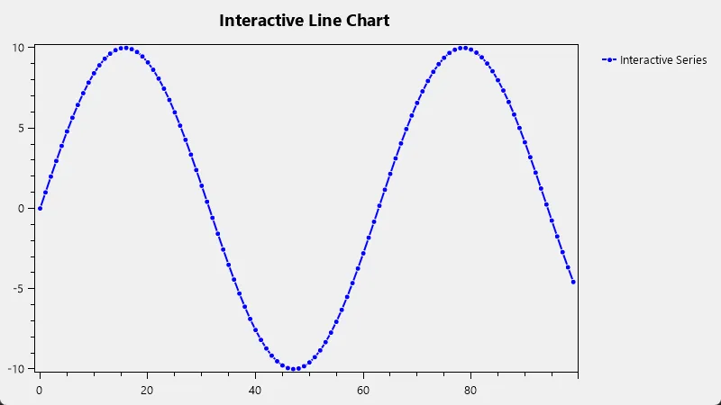
这个例子添加了工具提示功能,当用户将鼠标悬停在数据点上时,会显示该点的X和Y值。同时,用户可以使用鼠标进行缩放和平移操作。
动态更新数据
在实时应用中,我们经常需要动态更新图表数据。以下是一个示例,展示如何创建一个实时更新的线图:
C#public partial class Form1 : Form
{
    private PlotModel plotModel;
    private LineSeries series;
    private Timer timer;
    private int dataIndex = 0;

    public Form1()
    {
        InitializeComponent();
        CreateDynamicLineChart();
    }

    private void CreateDynamicLineChart()
    {
        var plotView = new PlotView();
        plotView.Dock = DockStyle.Fill;
        this.Controls.Add(plotView);

        plotModel = new PlotModel { Title = "Dynamic Line Chart" };
        series = new LineSeries { Title = "Real-time Data" };
        plotModel.Series.Add(series);

        plotView.Model = plotModel;

        timer = new Timer();
        timer.Interval = 100; // 每100毫秒更新一次
        timer.Tick += Timer_Tick;
        timer.Start();
    }

    private void Timer_Tick(object sender, EventArgs e)
    {
        // 生成新的数据点
        double y = Math.Sin(dataIndex * 0.1) * 10 + Random.Shared.NextDouble() * 5;
        series.Points.Add(new DataPoint(dataIndex, y));

        // 保持最多显示100个点
        if (series.Points.Count > 100)
            series.Points.RemoveAt(0);

        // 更新X轴范围
        plotModel.Axes[0].Minimum = Math.Max(0, dataIndex - 100);
        plotModel.Axes[0].Maximum = dataIndex;

        // 刷新图表
        plotModel.InvalidatePlot(true);

        dataIndex++;
    }
}
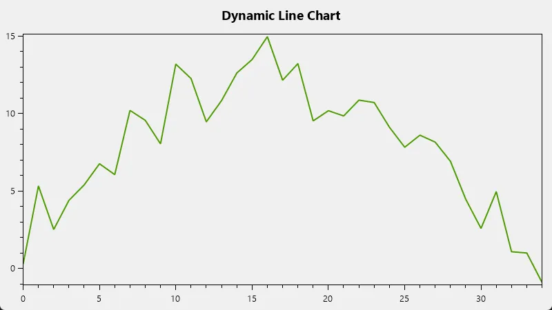
这个例子创建了一个动态更新的线图,每100毫秒添加一个新的数据点,并保持最多显示100个点。
多Y轴线图
当需要在同一图表中显示具有不同范围的多个数据系列时,多Y轴非常有用。以下是一个示例:
C#private void CreateMultipleYAxisLineChart()
{
    var plotView = new PlotView();
    plotView.Dock = DockStyle.Fill;
    this.Controls.Add(plotView);

    var plotModel = new PlotModel { Title = "Multiple Y-Axis Line Chart" };

    var series1 = new LineSeries
    {
        Title = "Series 1 (Left Axis)",
        Color = OxyColors.Blue,
        YAxisKey = "Left"
    };

    var series2 = new LineSeries
    {
        Title = "Series 2 (Right Axis)",
        Color = OxyColors.Red,
        YAxisKey = "Right"
    };

    for (int i = 0; i < 100; i++)
    {
        series1.Points.Add(new DataPoint(i, Math.Sin(i * 0.1) * 10));
        series2.Points.Add(new DataPoint(i, Math.Cos(i * 0.1) * 1000));
    }

    plotModel.Series.Add(series1);
    plotModel.Series.Add(series2);

    plotModel.Axes.Add(new LinearAxis
    {
        Position = AxisPosition.Left,
        Title = "Left Axis",
        Key = "Left",
        TextColor = OxyColors.Blue
    });

    plotModel.Axes.Add(new LinearAxis
    {
        Position = AxisPosition.Right,
        Title = "Right Axis",
        Key = "Right",
        TextColor = OxyColors.Red
    });

    plotModel.Legends.Add(new Legend
    {
        LegendPosition = LegendPosition.TopLeft,
        LegendPlacement = LegendPlacement.Inside
    });

    plotView.Model = plotModel;
}
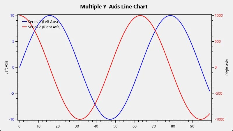
这个例子创建了一个具有两个Y轴的图表,每个系列使用不同的Y轴。
带注释的线图
注释可以用来突出显示图表中的特定点或区域。以下是一个带注释的线图示例:
C#private void CreateAnnotatedLineChart()
{
    var plotView = new PlotView();
    plotView.Dock = DockStyle.Fill;
    this.Controls.Add(plotView);

    var plotModel = new PlotModel { Title = "Annotated Line Chart" };

    var series = new LineSeries { Title = "Data Series" };

    for (int i = 0; i < 100; i++)
    {
        series.Points.Add(new DataPoint(i, Math.Sin(i * 0.1) * 10));
    }

    plotModel.Series.Add(series);

    // 添加点注释
    plotModel.Annotations.Add(new PointAnnotation
    {
        X = 50,
        Y = Math.Sin(50 * 0.1) * 10,
        Text = "Peak"
    });

    // 添加文本注释
    plotModel.Annotations.Add(new TextAnnotation
    {
        TextPosition = new DataPoint(25, 8),
        Text = "Important Region"
    });

    // 添加区域注释
    plotModel.Annotations.Add(new RectangleAnnotation
    {
        MinimumX = 60,
        MaximumX = 80,
        MinimumY = -10,
        MaximumY = 10,
        Fill = OxyColor.FromAColor(120, OxyColors.SkyBlue),
        Text = "Interesting Area"
    });

    plotView.Model = plotModel;
}
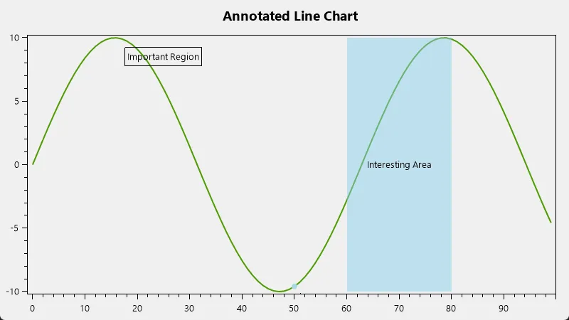
这个例子展示了如何添加点注释、文本注释和区域注释到线图中。
虚线和点线
OxyPlot支持各种线型,包括虚线和点线。以下是一个示例:
C#private void CreateDashedLineChart()
{
    var plotView = new PlotView();
    plotView.Dock = DockStyle.Fill;
    this.Controls.Add(plotView);

    var plotModel = new PlotModel { Title = "Dashed and Dotted Line Chart" };

    var series1 = new LineSeries
    {
        Title = "Dashed Line",
        LineStyle = LineStyle.Dash,
        Color = OxyColors.Blue
    };

    var series2 = new LineSeries
    {
        Title = "Dotted Line",
        LineStyle = LineStyle.Dot,
        Color = OxyColors.Red
    };

    var series3 = new LineSeries
    {
        Title = "Dash-Dot Line",
        LineStyle = LineStyle.DashDot,
        Color = OxyColors.Green
    };

    for (int i = 0; i < 100; i++)
    {
        series1.Points.Add(new DataPoint(i, Math.Sin(i * 0.1) * 10));
        series2.Points.Add(new DataPoint(i, Math.Cos(i * 0.1) * 10));
        series3.Points.Add(new DataPoint(i, Math.Tan(i * 0.1)));
    }

    plotModel.Series.Add(series1);
    plotModel.Series.Add(series2);
    plotModel.Series.Add(series3);

    plotModel.Legends.Add(new Legend
    {
        LegendPosition = LegendPosition.TopRight,
        LegendPlacement = LegendPlacement.Inside
    });

    plotView.Model = plotModel;
}

这个例子创建了三个不同线型的系列:虚线、点线和虚点线。
带误差条的线图
在科学和统计分析中,误差条常用于表示数据的不确定性。以下是一个带误差条的线图示例:
C#private void CreateLineChartWithErrorBars()
{
    var plotView = new PlotView();
    plotView.Dock = DockStyle.Fill;
    this.Controls.Add(plotView);

    var plotModel = new PlotModel { Title = "Line Chart with Error Bars" };

    var series = new LineSeries { Title = "Data with Error" };
    var errorSeries = new ErrorBarSeries { Title = "Error" };

    var random = new Random(0);
    for (int i = 0; i < 10; i++)
    {
        double y = Math.Sin(i * 0.5) * 10;
        double error = random.NextDouble() * 2;
        series.Points.Add(new DataPoint(i, y));
        errorSeries.Items.Add(new ErrorBarItem(i, error));
    }

    plotModel.Series.Add(series);
    plotModel.Series.Add(errorSeries);

    plotView.Model = plotModel;
}
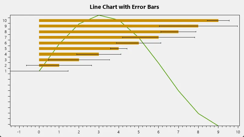
这个例子创建了一个带有误差条的线图,误差条表示每个数据点的不确定性范围。
平滑曲线
对于某些应用,可能需要平滑的曲线而不是直线段。OxyPlot提供了创建平滑曲线的选项:
C#private void CreateSmoothLineChart()
{
    var plotView = new PlotView();
    plotView.Dock = DockStyle.Fill;
    this.Controls.Add(plotView);

    var plotModel = new PlotModel { Title = "Smooth Line Chart" };

    var series = new LineSeries
    {
        Title = "Smooth Curve",
        InterpolationAlgorithm = InterpolationAlgorithms.CanonicalSpline
    };

    for (int i = 0; i < 10; i++)
    {
        series.Points.Add(new DataPoint(i, Math.Sin(i * 0.5) * 10));
    }

    plotModel.Series.Add(series);

    plotView.Model = plotModel;
}
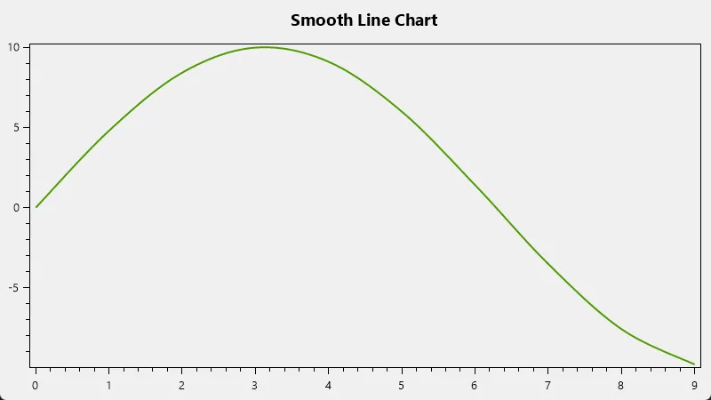 这个例子使用了样条插值算法来创建平滑的曲线。
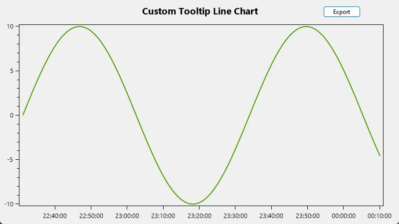
自定义工具提示
OxyPlot允许自定义工具提示的内容和格式。以下是一个示例:
C#private void CreateCustomTooltipLineChart()
{
    var plotView = new PlotView();
    plotView.Dock = DockStyle.Fill;
    this.Controls.Add(plotView);

    var plotModel = new PlotModel { Title = "Custom Tooltip Line Chart" };

    var series = new LineSeries
    {
        Title = "Custom Tooltip Series",
        TrackerFormatString = "Point: {2:0.00}, {4:0.00}\nValue: {4:0.00}\nTime: {2:hh:mm:ss}"
    };

    var startTime = DateTime.Now;
    for (int i = 0; i < 100; i++)
    {
        var time = DateTimeAxis.ToDouble(startTime.AddMinutes(i));
        series.Points.Add(new DataPoint(time, Math.Sin(i * 0.1) * 10));
    }

    plotModel.Series.Add(series);
    plotModel.Axes.Add(new DateTimeAxis { Position = AxisPosition.Bottom, StringFormat = "HH:mm:ss" });

    plotView.Model = plotModel;
}
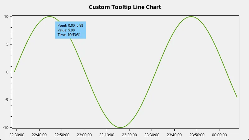 这个例子自定义了工具提示,显示点的坐标、值和时间。
导出图表
OxyPlot支持将图表导出为各种格式,如PNG、SVG等。以下是一个导出图表的示例:
C#private void ExportChart(PlotModel plotModel, string fileName)
{
    var pngExporter = new PngExporter { Width = 600, Height = 400 };
    pngExporter.ExportToFile(plotModel, fileName);

    MessageBox.Show($"Chart exported to {fileName}", "Export Successful", MessageBoxButtons.OK, MessageBoxIcon.Information);
}

// 在某个按钮点击事件中调用
private void exportButton_Click(object sender, EventArgs e)
{
    using (SaveFileDialog saveFileDialog = new SaveFileDialog())
    {
        saveFileDialog.Filter = "PNG Image|*.png";
        saveFileDialog.Title = "Save Chart as PNG";
        saveFileDialog.FileName = "Chart.png";

        if (saveFileDialog.ShowDialog() == DialogResult.OK)
        {
            ExportChart(plotView.Model, saveFileDialog.FileName);
        }
    }
}
 这个例子展示了如何将图表导出为PNG文件。
最佳实践和性能优化
- 数据点优化:对于大量数据点,考虑使用
DataPointSeries而不是LineSeries。 - 异步加载:对于大型数据集,考虑在后台线程中加载数据。
- 缓存:如果数据不经常变化,可以缓存
PlotModel以提高性能。 - 限制更新频率:对于实时数据,限制更新频率以避免过度重绘。
- 使用适当的轴类型:例如,对于日期时间数据使用
DateTimeAxis。 - 避免过度使用注释:大量注释可能会影响性能。
结论
OxyPlot为WinForms应用程序提供了强大而灵活的线图创建功能。从基本的线图到复杂的多轴、多系列图表,从静态展示到动态更新,OxyPlot都能满足各种需求。通过本指南中的示例和技巧,您应该能够在WinForms应用中创建出专业、美观且功能丰富的线图。
记住,图表的最终目标是清晰、有效地传达信息。在追求复杂功能的同时,也要注意保持图表的简洁和可读性。随着实践的深入,您将能够更好地平衡这些因素,创建出既美观又实用的图表。
本文作者:rick
本文链接:
版权声明:本博客所有文章除特别声明外,均采用 BY-NC-SA 许可协议。转载请注明出处!