请注意,本文编写于 189 天前,最后修改于 189 天前,其中某些信息可能已经过时。
目录
Windows Presentation Foundation (WPF) 是一个现代化的用户界面框架,专为构建 Windows 应用程序而设计。它通过分层的技术架构和丰富的功能集,提供了全面的应用程序开发解决方案。本文将探讨 WPF 的技术架构、核心优势以及一些示例代码,以帮助开发者更好地理解和应用这一框架,其实按我最浅显的理解,WPF更接近Web的一些应用技术,或者说更早的的一种实验。
技术架构
WPF 采用分层架构设计,主要包括以下几个层次:
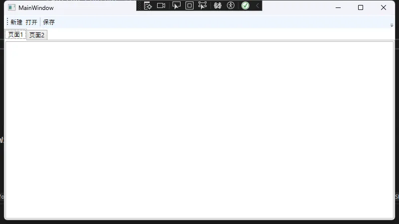
XAML(可扩展应用程序标记语言):WPF 的声明式 UI 语言,允许开发者以 XML 格式定义用户界面。XAML 使得界面开发更加直观和高效。
XML<Grid>
    <Grid.RowDefinitions>
        <RowDefinition Height="Auto"/>
        <RowDefinition Height="*"/>
    </Grid.RowDefinitions>
    <ToolBar Grid.Row="0">
        <Button Content="新建" />
        <Button Content="打开" />
        <Separator />
        <Button Content="保存" />
    </ToolBar>
    <TabControl Grid.Row="1">
        <TabItem Header="页面1">
            <TextBox AcceptsReturn="True" />
        </TabItem>
        <TabItem Header="页面2">
            <DataGrid AutoGenerateColumns="True" />
        </TabItem>
    </TabControl>
</Grid>
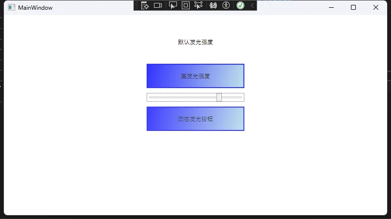
依赖属性:WPF 属性系统的核心,支持属性值计算、继承和动画。依赖属性使得属性的值可以通过数据绑定、样式和动画进行动态更新。
C#public class ColorfulButton : Button
{
    // 定义依赖属性
    public static readonly DependencyProperty GlowIntensityProperty =
        DependencyProperty.Register(
            "GlowIntensity",           // 属性名称
            typeof(double),            // 属性类型
            typeof(ColorfulButton),    // 所有者类型
            new PropertyMetadata(0.0, OnGlowIntensityChanged) // 默认值和回调
        );

    // CLR属性包装器
    public double GlowIntensity
    {
        get { return (double)GetValue(GlowIntensityProperty); }
        set { SetValue(GlowIntensityProperty, value); }
    }

    // 静态构造函数
    static ColorfulButton()
    {
        // 设置默认样式
        DefaultStyleKeyProperty.OverrideMetadata(
            typeof(ColorfulButton),
            new FrameworkPropertyMetadata(typeof(ColorfulButton))
        );
    }

    // 当属性值变化时的回调方法
    private static void OnGlowIntensityChanged(DependencyObject d, DependencyPropertyChangedEventArgs e)
    {
        var button = d as ColorfulButton;
        if (button != null)
        {
            // 创建一个渐变背景,根据发光强度调整透明度
            var gradientBrush = new LinearGradientBrush
            {
                StartPoint = new Point(0, 0),
                EndPoint = new Point(1, 1)
            };

            // 添加渐变色点
            gradientBrush.GradientStops.Add(new GradientStop(Colors.Blue, 0));
            gradientBrush.GradientStops.Add(new GradientStop(Colors.LightBlue, 1));

            // 设置整体透明度
            button.Background = gradientBrush;
            button.Opacity = (double)e.NewValue;

            // 添加一些额外的视觉效果
            button.BorderBrush = Brushes.Blue;
            button.BorderThickness = new Thickness(2);
        }
    }
}
XML<Window x:Class="App01.MainWindow"
        xmlns="http://schemas.microsoft.com/winfx/2006/xaml/presentation"
        xmlns:x="http://schemas.microsoft.com/winfx/2006/xaml"
        xmlns:d="http://schemas.microsoft.com/expression/blend/2008"
        xmlns:mc="http://schemas.openxmlformats.org/markup-compatibility/2006"
        xmlns:local="clr-namespace:App01"
        mc:Ignorable="d"
        Title="MainWindow" Height="450" Width="800">
    <Window.Resources>
        <Style TargetType="{x:Type local:ColorfulButton}">
            <Setter Property="Template">
                <Setter.Value>
                    <ControlTemplate TargetType="{x:Type local:ColorfulButton}">
                        <Border Background="{TemplateBinding Background}"
                                BorderBrush="{TemplateBinding BorderBrush}"
                                BorderThickness="{TemplateBinding BorderThickness}">
                            <ContentPresenter
                                HorizontalAlignment="Center"
                                VerticalAlignment="Center"/>
                        </Border>
                    </ControlTemplate>
                </Setter.Value>
            </Setter>
        </Style>
    </Window.Resources>
    <StackPanel Margin="20">
        <local:ColorfulButton
            Content="默认发光强度"
            Width="200"
            Height="50"
            Margin="0,10"/>

        <local:ColorfulButton
            Content="高发光强度"
            Width="200"
            Height="50"
            GlowIntensity="0.8"
            Margin="0,10"/>

        <Slider
            Minimum="0"
            Maximum="1"
            Value="0.5"
            Width="200"
            x:Name="glowSlider"/>

        <local:ColorfulButton
            Content="动态发光按钮"
            Width="200"
            Height="50"
            GlowIntensity="{Binding Value, ElementName=glowSlider}"
            Margin="0,10"/>
    </StackPanel>
</Window>
路由事件:WPF 支持事件隧道(Preview)和冒泡(Bubble),使得事件处理更加灵活。
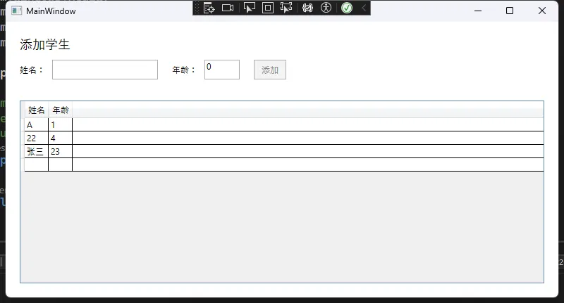
MVVM(模型-视图-视图模型)模式:WPF 强调 MVVM 架构,促进了数据绑定和命令的使用,使得 UI 和业务逻辑的分离更加清晰。
C#public class Student : INotifyPropertyChanged
{
    private string _name;
    private int _age;

    public string Name
    {
        get => _name;
        set
        {
            if (_name != value)
            {
                _name = value;
                OnPropertyChanged(nameof(Name));
            }
        }
    }

    public int Age
    {
        get => _age;
        set
        {
            if (_age != value)
            {
                _age = value;
                OnPropertyChanged(nameof(Age));
            }
        }
    }

    public event PropertyChangedEventHandler PropertyChanged;

    protected virtual void OnPropertyChanged(string propertyName)
    {
        PropertyChanged?.Invoke(this, new PropertyChangedEventArgs(propertyName));
    }
}
C#public class StudentViewModel : INotifyPropertyChanged
{
    private Student _currentStudent;
    public ObservableCollection<Student> Students { get; set; }

    public Student CurrentStudent
    {
        get => _currentStudent;
        set
        {
            _currentStudent = value;
            OnPropertyChanged(nameof(CurrentStudent));
        }
    }

    public ICommand AddStudentCommand { get; private set; }

    public StudentViewModel()
    {
        Students = new ObservableCollection<Student>();
        CurrentStudent = new Student();

        AddStudentCommand = new RelayCommand(AddStudent, CanAddStudent);
    }

    private void AddStudent()
    {
        Students.Add(new Student
        {
            Name = CurrentStudent.Name,
            Age = CurrentStudent.Age
        });
        CurrentStudent = new Student(); // 重置当前学生
    }

    private bool CanAddStudent()
    {
        return !string.IsNullOrWhiteSpace(CurrentStudent.Name) && CurrentStudent.Age > 0;
    }

    public event PropertyChangedEventHandler PropertyChanged;

    protected virtual void OnPropertyChanged(string propertyName)
    {
        PropertyChanged?.Invoke(this, new PropertyChangedEventArgs(propertyName));
    }
}

// 自定义命令接口实现
public class RelayCommand : ICommand
{
    private readonly Action _execute;
    private readonly Func<bool> _canExecute;

    public RelayCommand(Action execute, Func<bool> canExecute = null)
    {
        _execute = execute ?? throw new ArgumentNullException(nameof(execute));
        _canExecute = canExecute;
    }

    public event EventHandler CanExecuteChanged
    {
        add { CommandManager.RequerySuggested += value; }
        remove { CommandManager.RequerySuggested -= value; }
    }

    public bool CanExecute(object parameter) => _canExecute == null || _canExecute();

    public void Execute(object parameter) => _execute();
}
XML<Grid Margin="20">
    <Grid.RowDefinitions>
        <RowDefinition Height="Auto"/>
        <RowDefinition Height="*"/>
    </Grid.RowDefinitions>

    <StackPanel Grid.Row="0" Margin="0,0,0,20">
        <TextBlock Text="添加学生" FontSize="18" Margin="0,0,0,10"/>

        <StackPanel Orientation="Horizontal" Margin="0,0,0,10">
            <TextBlock Text="姓名:" VerticalAlignment="Center" Margin="0,0,10,0"/>
            <TextBox Text="{Binding CurrentStudent.Name, UpdateSourceTrigger=PropertyChanged}"
                     Width="150" Margin="0,0,20,0"/>

            <TextBlock Text="年龄:" VerticalAlignment="Center" Margin="0,0,10,0"/>
            <TextBox Text="{Binding CurrentStudent.Age, UpdateSourceTrigger=PropertyChanged}"
                     Width="50"/>

            <Button Content="添加"
                    Command="{Binding AddStudentCommand}"
                    Margin="20,0,0,0"
                    Padding="10,5"/>
        </StackPanel>
    </StackPanel>

    <DataGrid Grid.Row="1"
              ItemsSource="{Binding Students}"
              AutoGenerateColumns="False">
        <DataGrid.Columns>
            <DataGridTextColumn Header="姓名" Binding="{Binding Name}"/>
            <DataGridTextColumn Header="年龄" Binding="{Binding Age}"/>
        </DataGrid.Columns>
    </DataGrid>
</Grid>
WPF的核心优势
- 声明式 UI:通过 XAML,开发者可以以声明的方式定义用户界面,提升了开发效率和可读性。
- 灵活的布局系统:WPF 提供了多种布局控件(如 Grid、StackPanel、DockPanel 等),支持响应式设计,能够适应不同屏幕尺寸和分辨率。
- 强大的数据绑定机制:WPF 的数据绑定功能使得 UI 和数据模型之间的交互变得简单而高效,支持双向绑定和数据转换。
- 样式和模板系统:WPF 允许开发者通过样式和控制模板自定义控件的外观,提升了应用程序的可定制性。
- 基于 DirectX 的图形渲染:WPF 利用 DirectX 提供高性能的图形渲染,支持复杂的图形和动画效果。
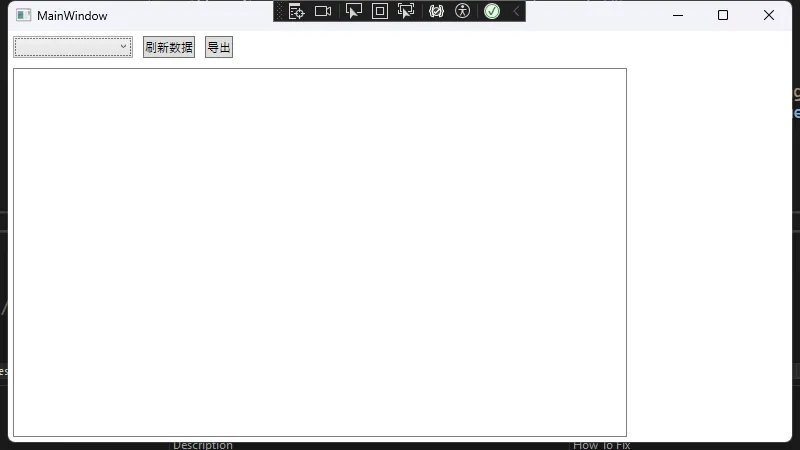
示例:数据可视化应用
以下是一个简单的数据可视化示例,展示了如何使用 WPF 创建一个包含图表和控制面板的窗口。
XML<Window x:Class="WpfApp.DataVisualizationWindow"
        xmlns="http://schemas.microsoft.com/winfx/2006/xaml/presentation"
        Title="数据可视化示例">
    <Grid>
        <Grid.RowDefinitions>
            <RowDefinition Height="Auto"/>
            <RowDefinition Height="*"/>
        </Grid.RowDefinitions>
        <StackPanel Grid.Row="0" Orientation="Horizontal">
            <ComboBox Width="120" Margin="5" ItemsSource="{Binding ChartTypes}" SelectedItem="{Binding SelectedChartType}"/>
            <Button Content="刷新数据" Command="{Binding RefreshCommand}" Margin="5"/>
            <Button Content="导出" Command="{Binding ExportCommand}" Margin="5"/>
        </StackPanel>
        <Grid Grid.Row="1">
            <Grid.ColumnDefinitions>
                <ColumnDefinition Width="*"/>
                <ColumnDefinition Width="Auto"/>
            </Grid.ColumnDefinitions>
            <Border Grid.Column="0" BorderBrush="Gray" BorderThickness="1" Margin="5">
                <Canvas x:Name="ChartCanvas">
                    <!-- 动态生成的图表内容 -->
                </Canvas>
            </Border>
            <StackPanel Grid.Column="1" Width="150" Margin="5">
                <ItemsControl ItemsSource="{Binding Legends}">
                    <ItemsControl.ItemTemplate>
                        <DataTemplate>
                            <StackPanel Orientation="Horizontal">
                                <Rectangle Width="16" Height="16" Fill="{Binding Color}" Margin="5"/>
                                <TextBlock Text="{Binding Name}" VerticalAlignment="Center"/>
                            </StackPanel>
                        </DataTemplate>
                    </ItemsControl.ItemTemplate>
                </ItemsControl>
            </StackPanel>
        </Grid>
    </Grid>
</Window>
结论
WPF 是一个功能强大的 UI 框架,凭借其分层架构和丰富的功能集,能够帮助开发者构建出既美观又高效的 Windows 应用程序。通过 XAML、依赖属性、MVVM 模式等特性,WPF 提供了灵活的开发方式,极大地提升了开发效率和应用质量。无论是企业级应用还是个人项目,WPF 都是一个值得考虑的选择。
本文作者:rick
本文链接:
版权声明:本博客所有文章除特别声明外,均采用 BY-NC-SA 许可协议。转载请注明出处!
目录